Feed the Children Website Redesign
Usability Testing Overview
10 participants
3 areas tested
Sponsor a child by making a trustworthy donation
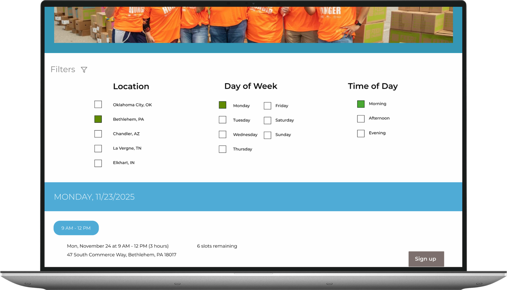
Find and sign up for volunteering opportunities
Learn more about the organization
7 tasks
15 usability issues found
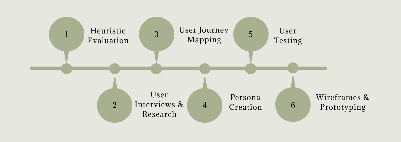
Steps Taken
This redesign will not only enhance the overall user experience on the Feed the Children website, but also create a more intuitive and accessible environment that fosters user confidence and trust in the organization’s impact. Ultimately, these improvements are expected to increase engagement, extend time on site, and drive more meaningful contributions to support children in need.
Why Redesign?
The website was evaluated using guided usability heuristic principles to identify key usability issues and uncover opportunities for improving clarity, efficiency, and overall user satisfaction. One violation found that was used in the redesign was regarding the search feature.

Heuristic Evaluation
Heuristic Violated: Help and Documentation
Issue: There is not easily accessible FAQs for users that have questions about their donations or those who may need assistance if it is their first time donating.
Suggestions: Create an easily accessible FAQs section where users can see commonly asked questions regarding their donations or improve on their search engine to aid in answering users questions.
Recommendation: Update search engine functionality/ capability to pull relevant searched information
User Interviews & Research
Key Findings
90% of participants donated to a non-profit organization before.
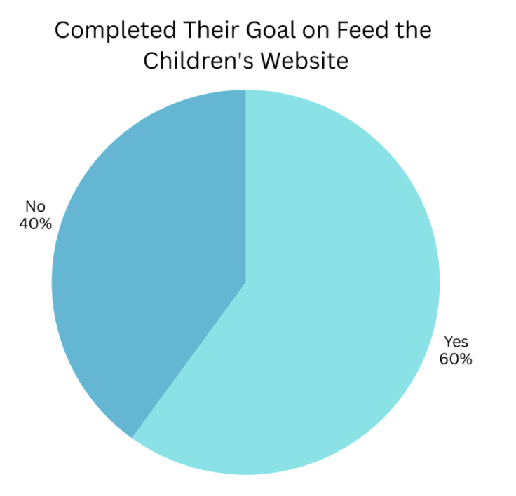
60% of participants completed their goal on the site.
70% of participants mentioned that they expect easy navigation on the site.
40% of participants mentioned that they expect easy navigation on the site.
10% of participants visited Feed the Children's website before.
100% of participants spend 20 or more hours online per week.
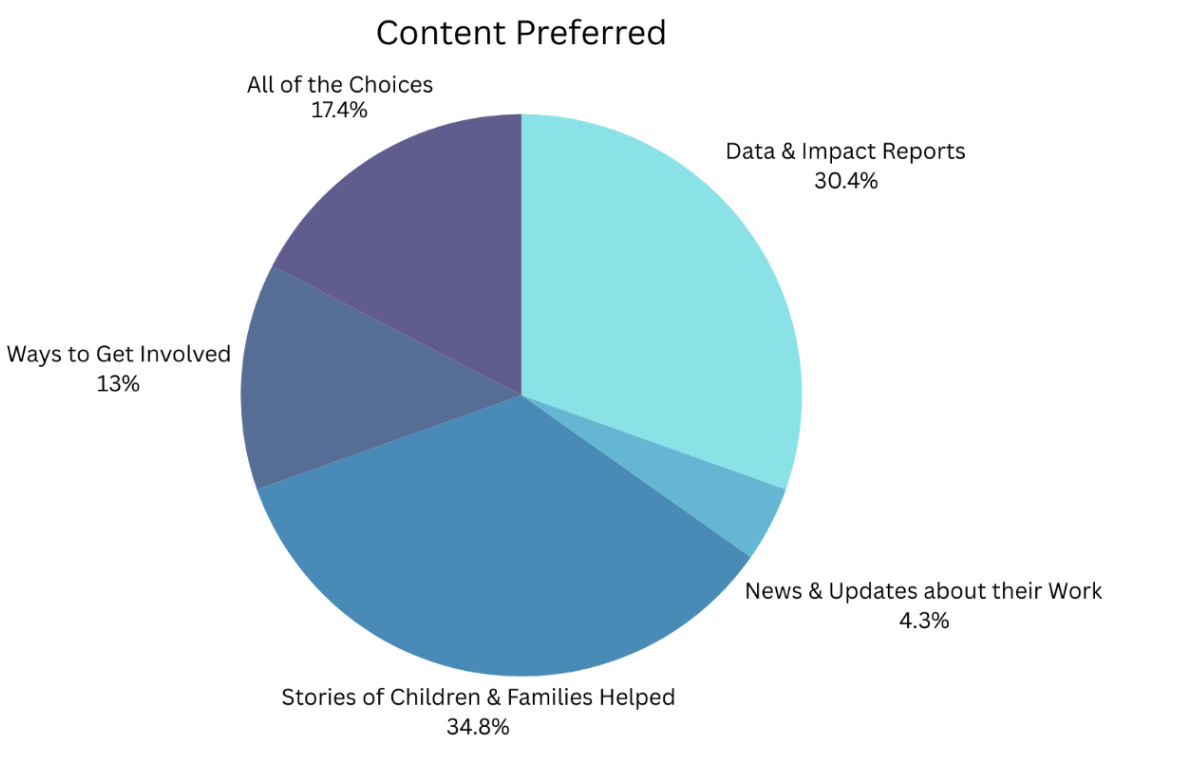
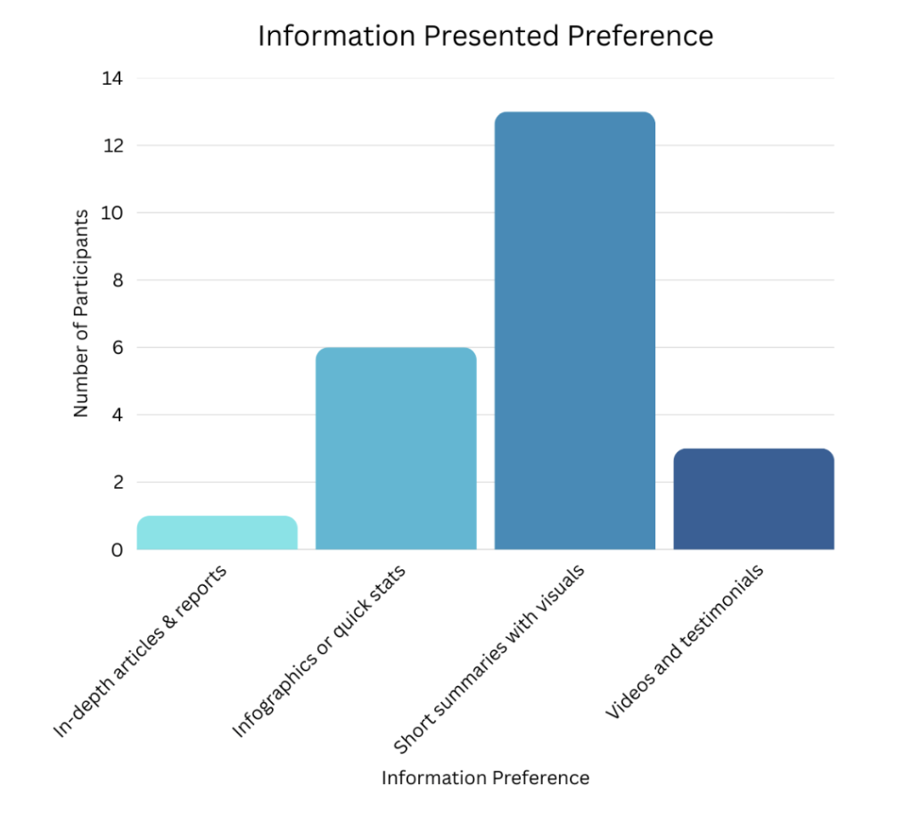
50% of participants prefer information presented as short summaries with visuals.
23 users participated in a survey
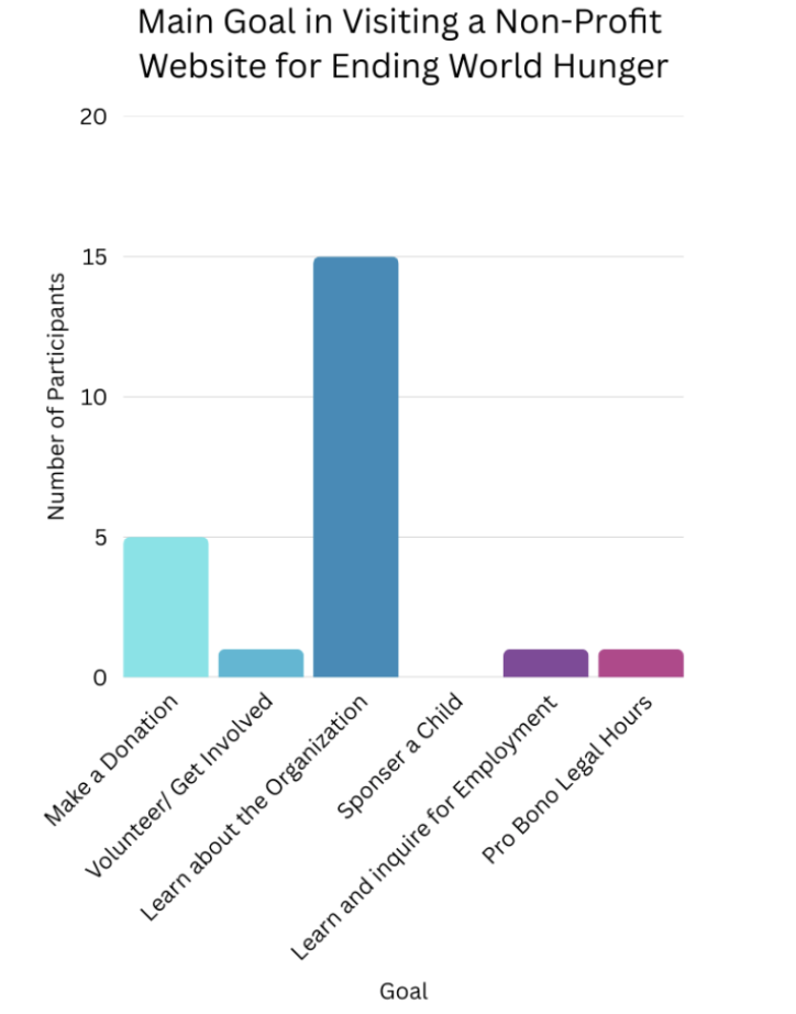
Surveys were conducted to better understand the needs of potential users on the website and organizations alike by gaining feedback on their current experiences.
User Journey
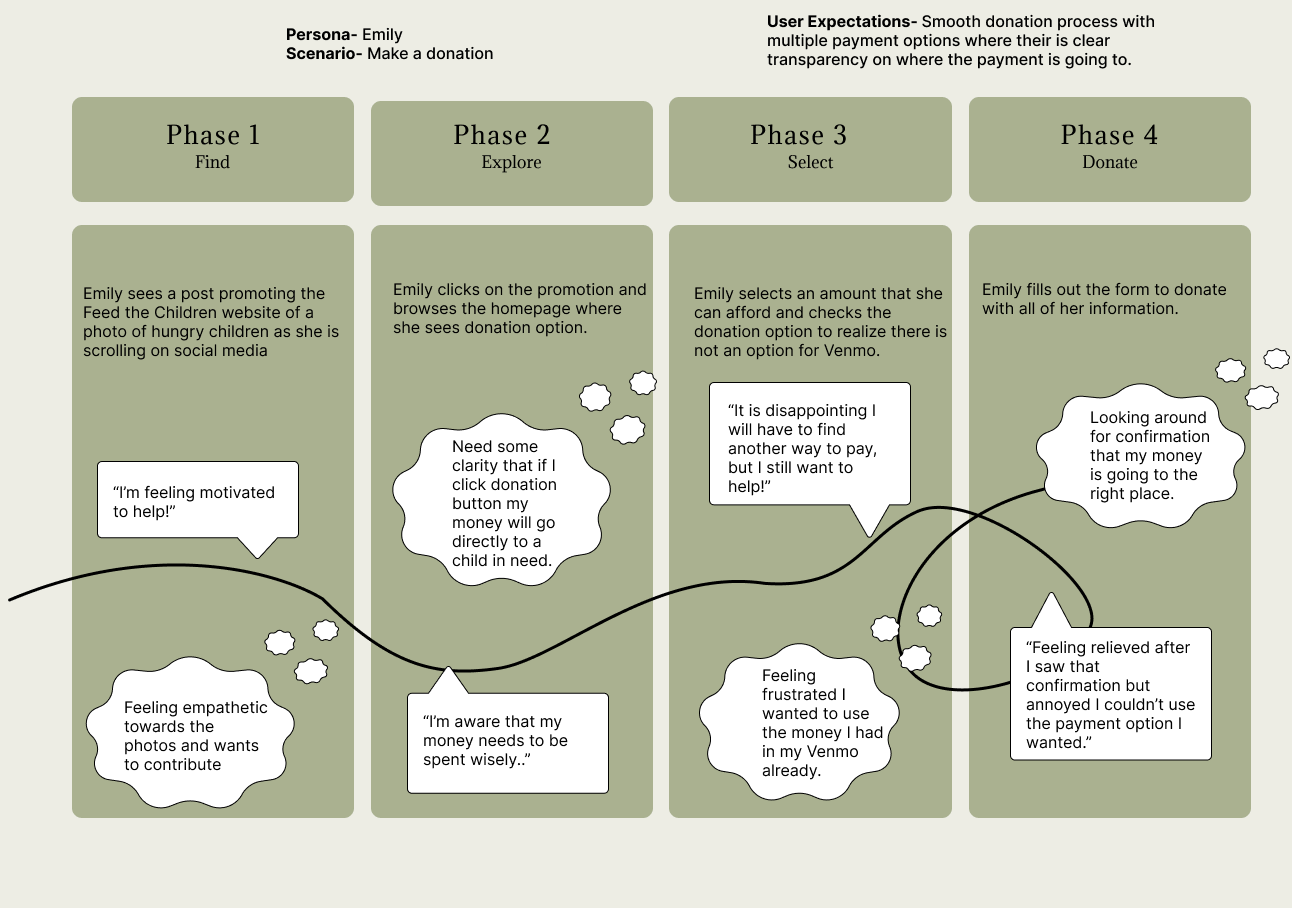
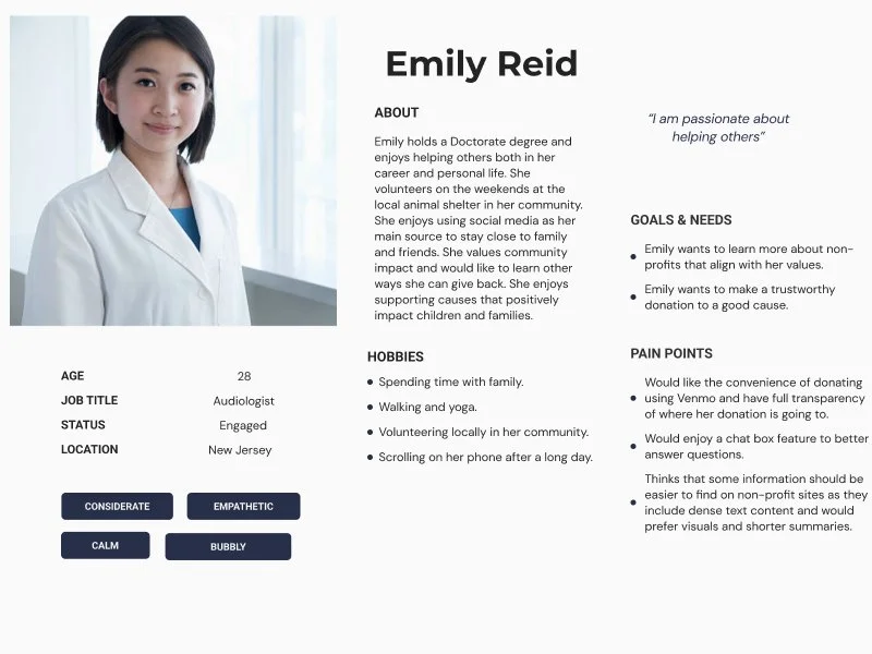
This user journey follows Emily, a potential donor, as she moves from discovering the site on social media to completing a donation. Initially motivated by empathy, she becomes more cautious as she explores the website, seeking clarity on how her contribution will be used. Her experience highlights key opportunities for improvement: clearer transparency about fund allocation and more flexible payment methods to create a smoother, more satisfying donation process.
Personas
User Testing Participants Included:
5 most like Emily
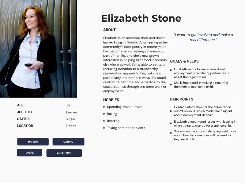
2 most like Elizabeth
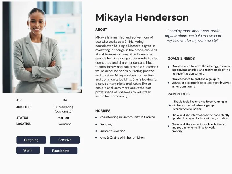
3 most like Mikayla
Three personas were created to represent specific groups of users with different demographic backgrounds, goals, frustrations, motivations, and pain points.
User Testing
Key Insights
44.4% of participants stated it was difficult to find what they were looking for.
89.9% of participants mentioned the difficulty in finding what they were looking for on the site.
44.4% of participants reported that nothing surprised them about the website.
66.7% participants reported finding confusing terms, labels, & buttons.
44.4% participants found the website trustworthy.
Blocker Issues Found:
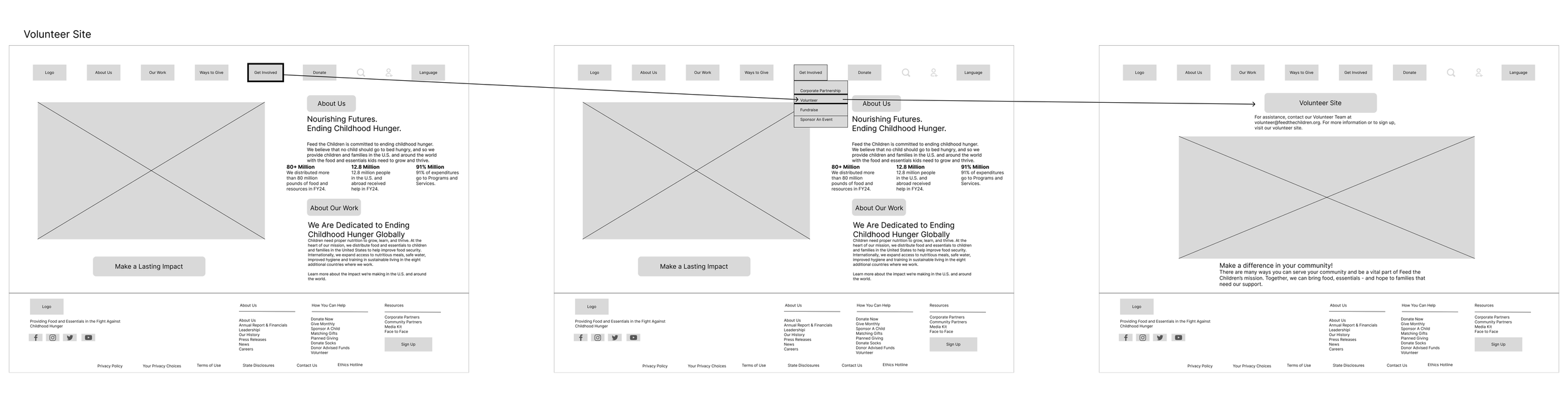
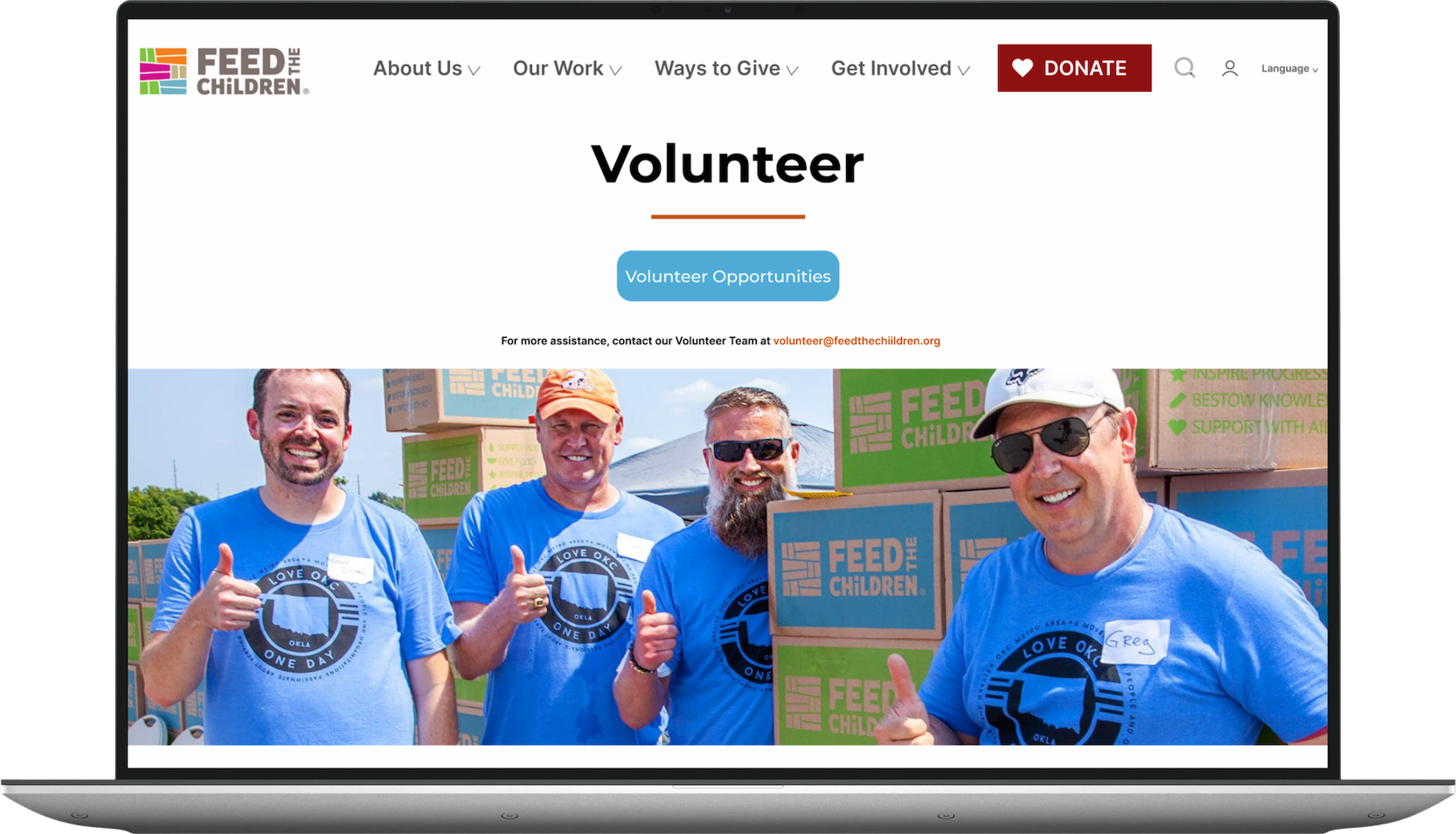
A participant was unable to find a hyperlink to get to volunteer opportunities because it did not look like a clickable button.
The search feature is not yielding relevant data, and it also takes up the whole screen and doesn't look trustworthy.
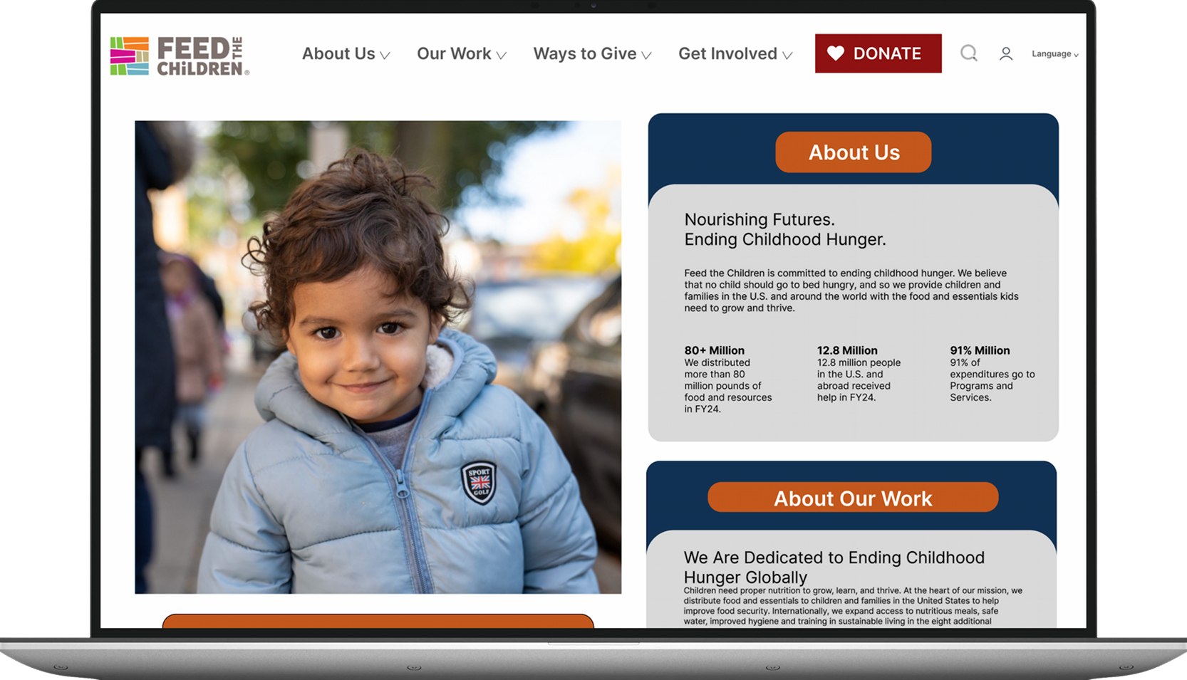
Participants had a difficult time finding the relevant mission statement and important information because it was not seen on the front page, since the page is full of just a child's photo, and you have to scroll or look under other tabs.
An evaluation of qualitative and quantitative data by observing users perform tasks on the website.
Nature of Research
8 total participants
Test conducted via Zoom (virtual) and in person
Participants provided consent to record their screen and audio while using the website
Participants recruited from researcher’s professional and personal networks
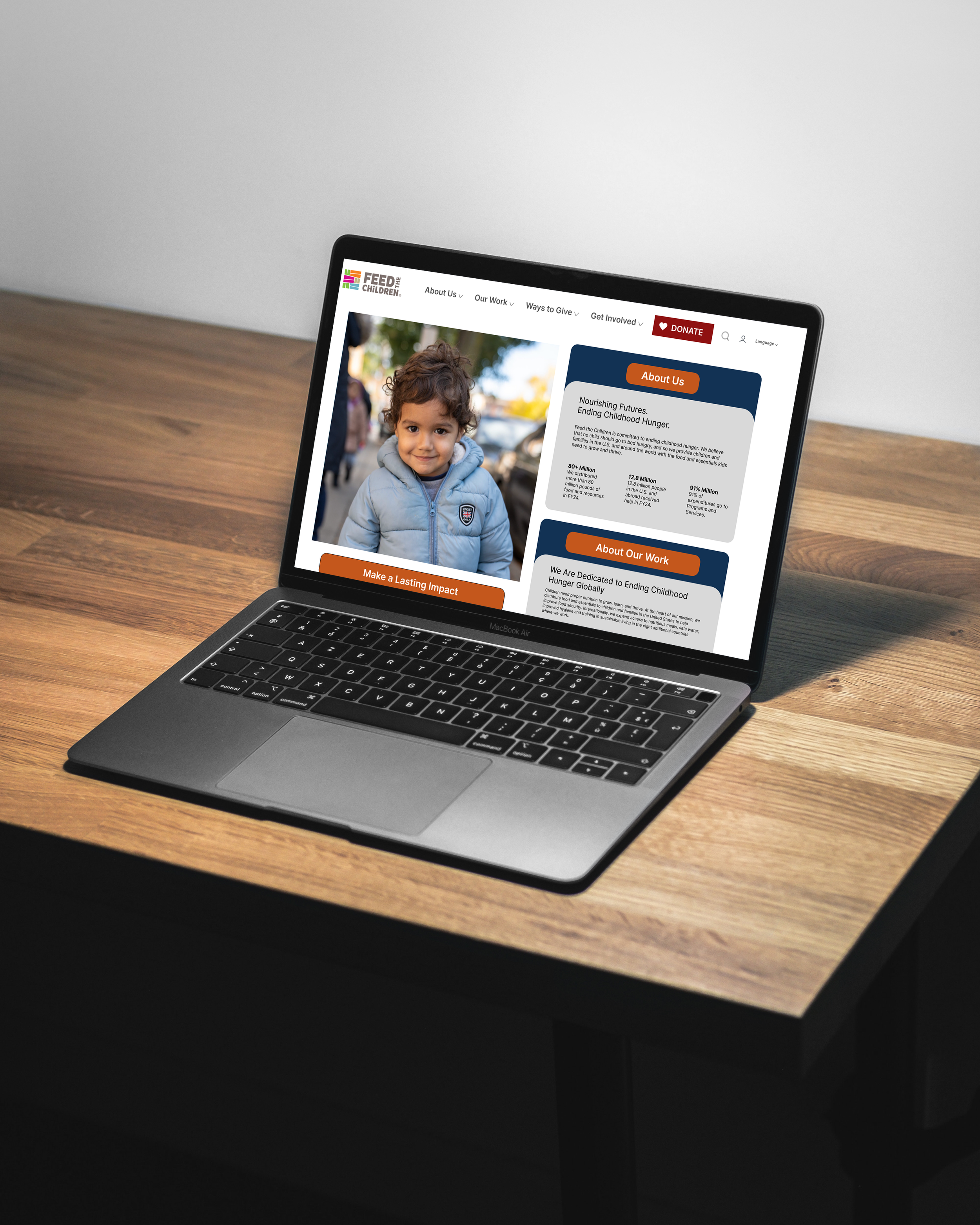
Wireframes & Prototyping
Low-fidelity wireframes were developed to visualize proposed design concepts and outline potential solutions to the identified usability issues. These wireframes helped refine layout, functionality, and user flows before moving into final design.
Low-Fidelity Wireframes
Redesign the homepage layout to prominently feature the organization’s mission and values, ensuring they are easily discoverable for users.
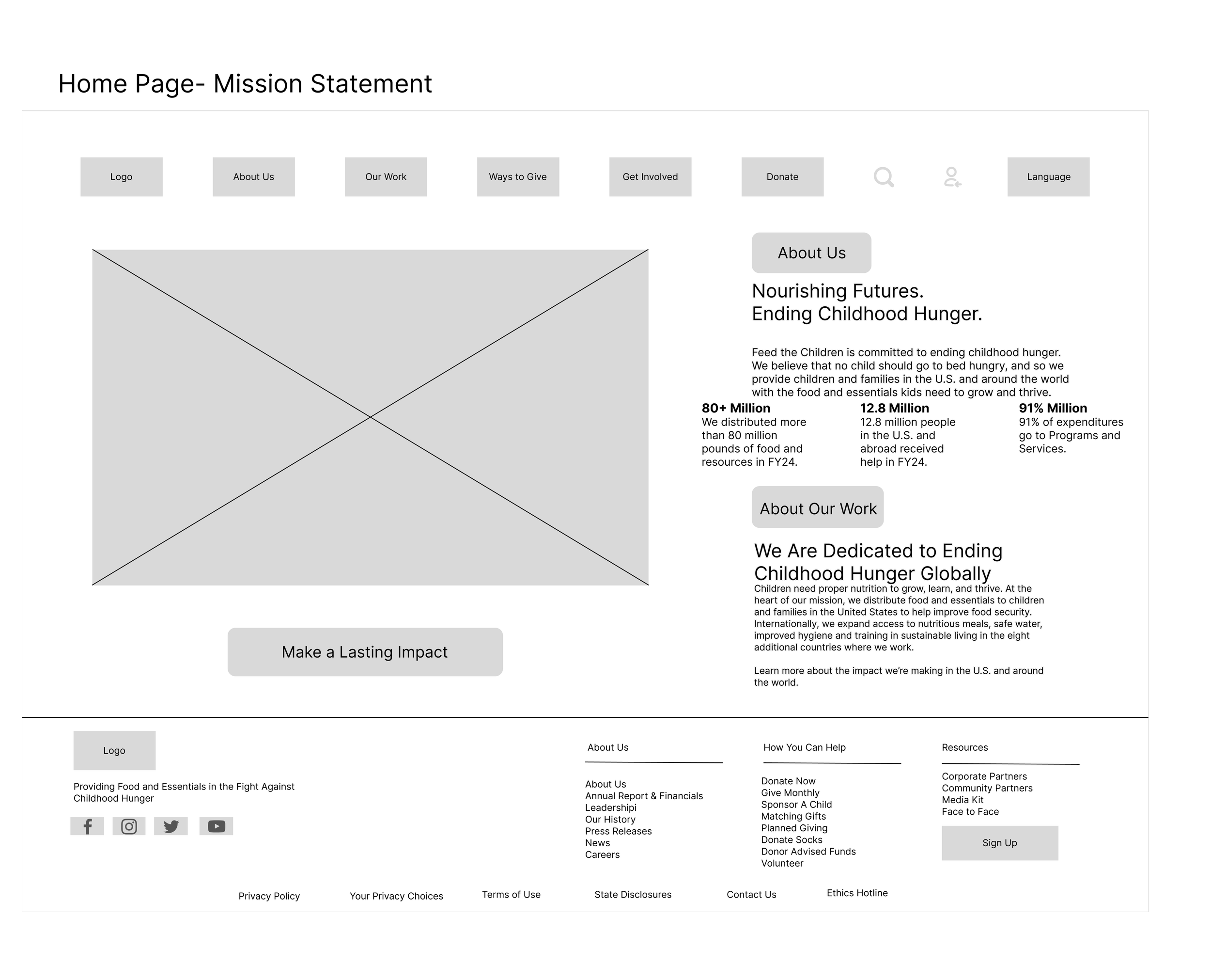
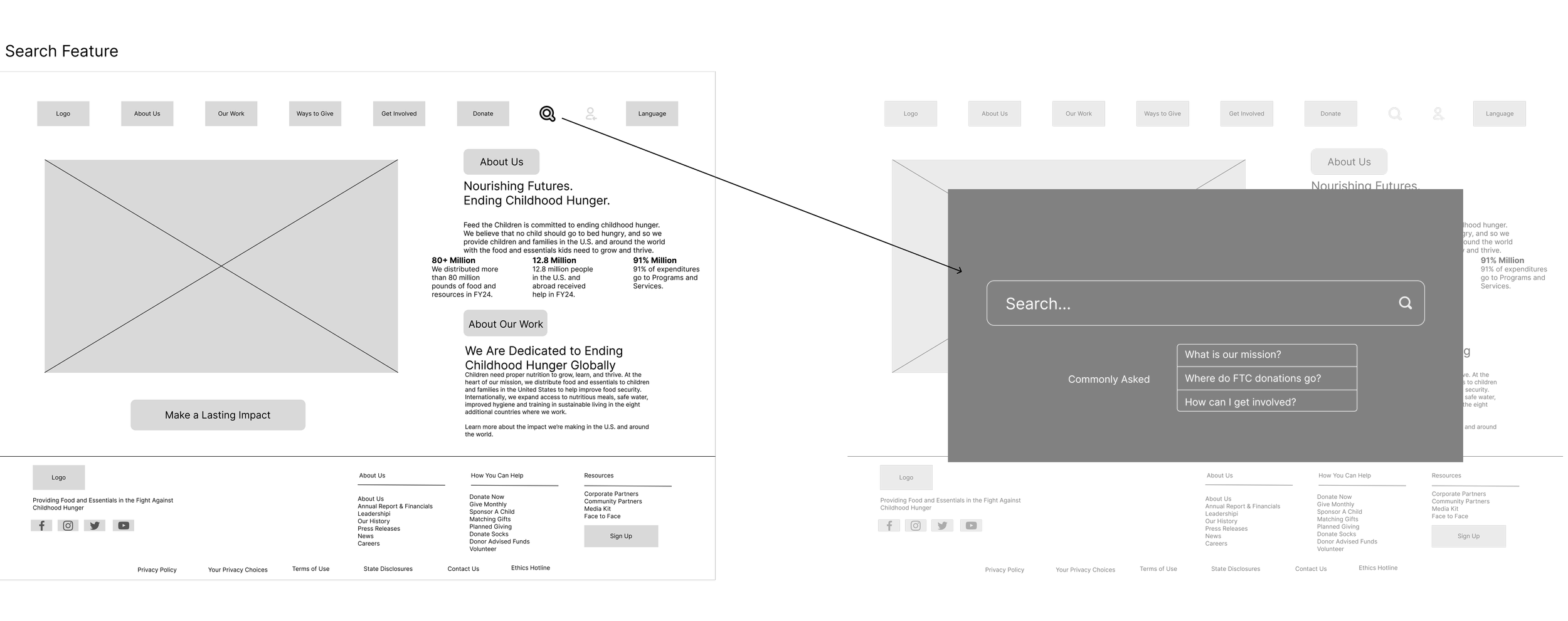
Enhance the search experience by refining the page’s visual design and incorporating a dedicated FAQ section to support users in finding relevant information more efficiently.
Elevate the visibility of the volunteer call-to-action by converting the existing hyperlink into a clearly identifiable button and placing it in a more prominent location to improve access to the volunteer page.
High-Fidelity Wireframes
These redesigns streamline access to key information and make it easier for users to navigate the site, ultimately improving usability, time on site and potentially reducing bounce rates.
Children website is vital to advancing the organization’s mission and values. A thoughtful redesign strengthens the connection between volunteers, donors, and the communities served, ensuring that every visitor can easily access the information and opportunities they need to make an impact.
By increasing the visibility of volunteer opportunities, presenting essential information in a clear and intuitive way, and improving the search experience for quicker and more accurate results, the website becomes a more reliable and user-friendly resource. These improvements not only build trust with supporters but also encourage deeper engagement and long-term involvement.
Creating a user-centered digital experience that reflects Feed the Children’s commitment to transparency, accessibility, and compassion ensures the platform continues to serve those who rely on it most and supports the organization’s ongoing efforts to end childhood hunger.

Prototype
This project was completed in collaboration with Jazmine Bryant over the course of 15 weeks.