
Concert Ticketing Site
Creating an app for concert users to efficiency browse, purchase, and use tickets.

The Challenge
Project Details:
Timeline: 5 weeks
Type: Academic Conceptual Project
Tools: Figma · Balsamiq · Crazy 8s Sketching
Role: UX Designer
Context: Designed for MOOD, a group of three live music venues in the Phoenix, AZ area
Mood's three Phoenix-area live music venues host concerts nearly every night — but every ticket is sold in person at the door. That means no advance planning for customers, long lines at showtime, and missed revenue for the business. There's also no single place for music fans to see what's happening across all three venues at once.
I was tasked to design a mobile app from the ground up: one that would let users discover events, filter by venue or genre, purchase tickets in advance, and access digital tickets on their phone at the door.
Approach
User Flow Creation
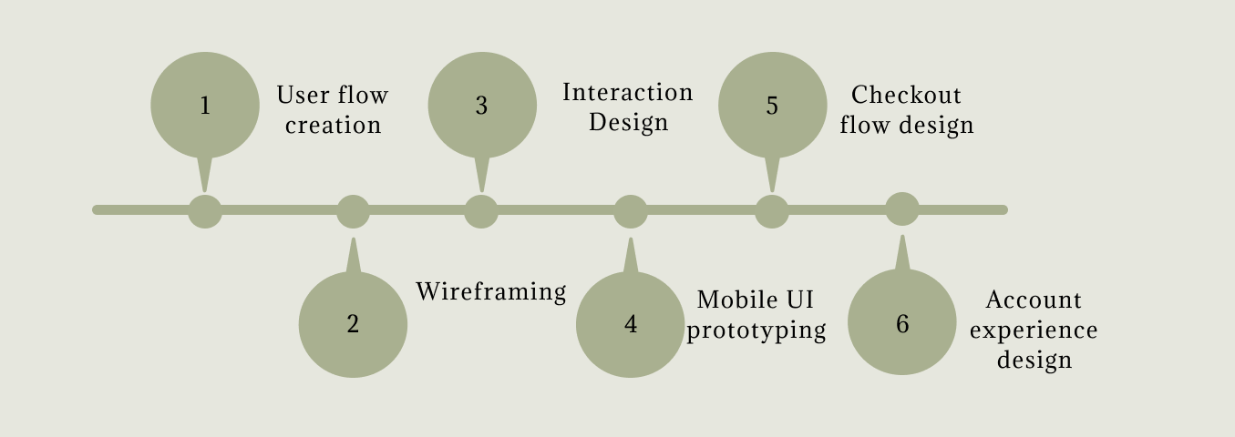
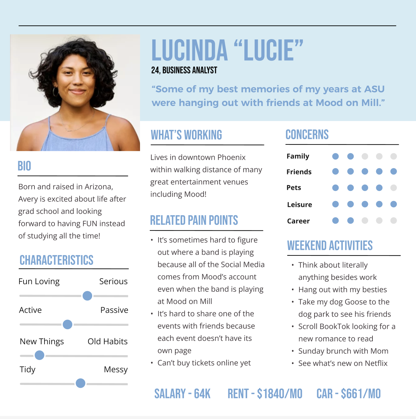
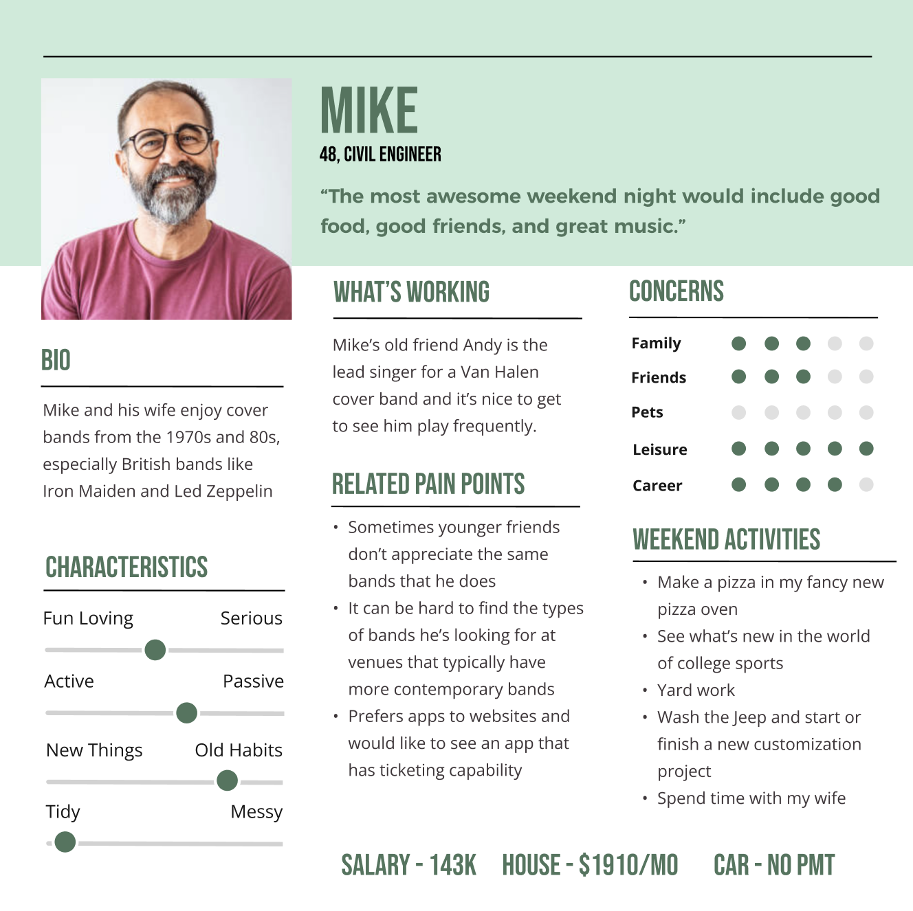
The two personas provided represent the range of Mood's audience: Lucie, a 24-year-old casual music fan who browses for fun, and Mike, a 48-year-old who plans ahead and attends regularly. These two users have very different mental models of how a ticketing experience should work. Lucie wants to browse and be surprised, while Mike wants to find his event quickly and check out. That tension shaped every navigation and layout decision made through an evaluation of business constraints.
Interaction Design & Mobile UI Ideation
With the personas and constraints clearly defined: general admission only, ten-ticket maximum, account required before accessing events, barcode compatibility needed. I could then begin ideation, and I used the Crazy 8s method to rapidly sketch possible layouts without committing to any single direction. The goal was to generate options quickly and let the constraints narrow them down, rather than designing around assumptions from the start.
How do you build a mobile concert ticket buying experience that feels effortless for casual purchases and frequent concert goers?
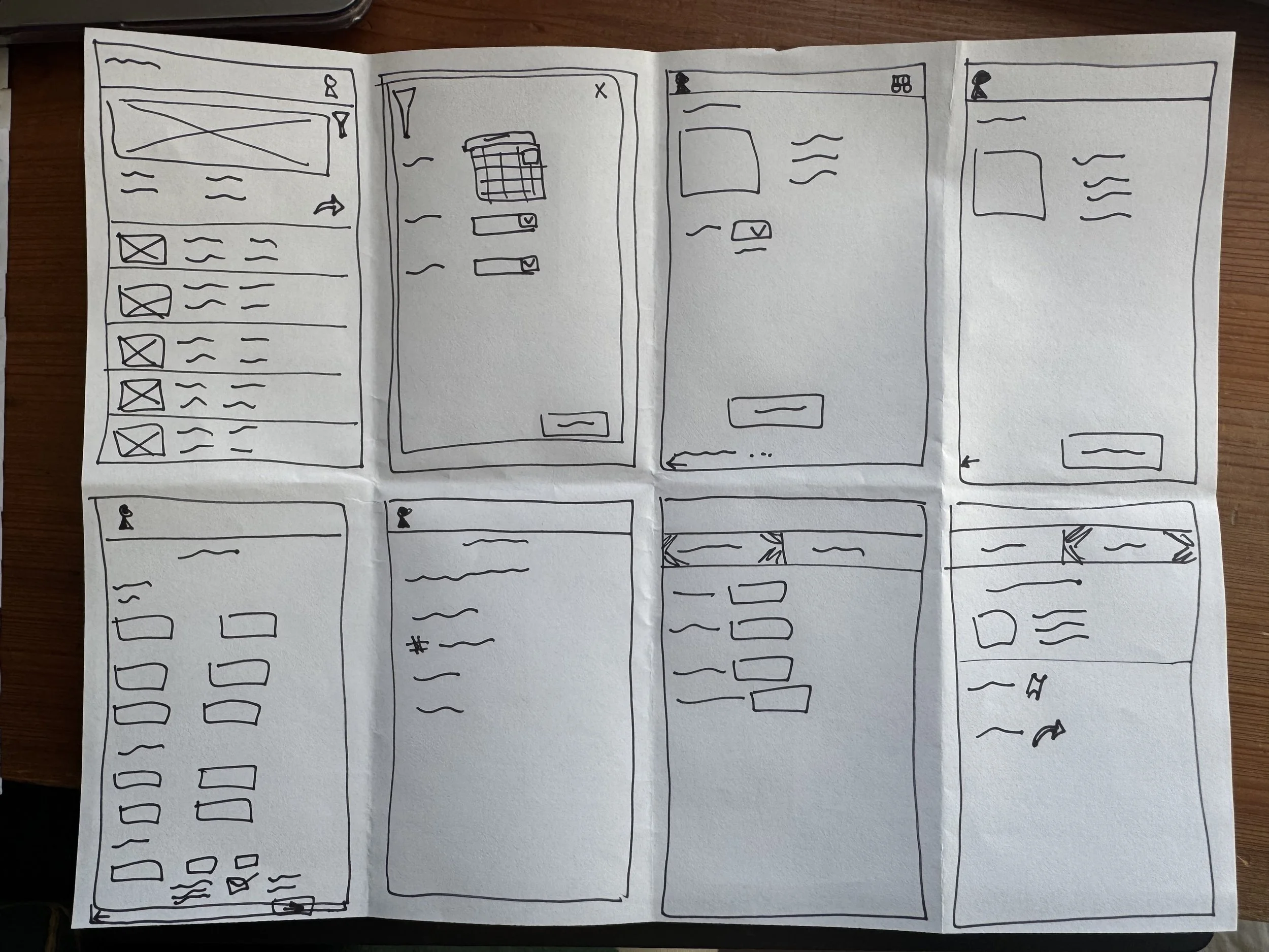
The Crazy 8s Method
Ideation of possible layouts for wireframes. A sketching method that assisted in helping brainstorm.
Wireframing
Checkout flow & Account Experience Design
Mid-fidelity Wireframes
The mid-fidelity wireframes helped me establish the core user flow: account creation → event discovery → ticket selection → checkout → digital ticket storage. Moving into high fidelity, I focused on three things that Lucie and Mike's needs demanded: a prominent promoted event for casual discovery, robust filtering for intentional browsing, and a clear, scan-ready ticket screen that's easy to pull up at the venue door.
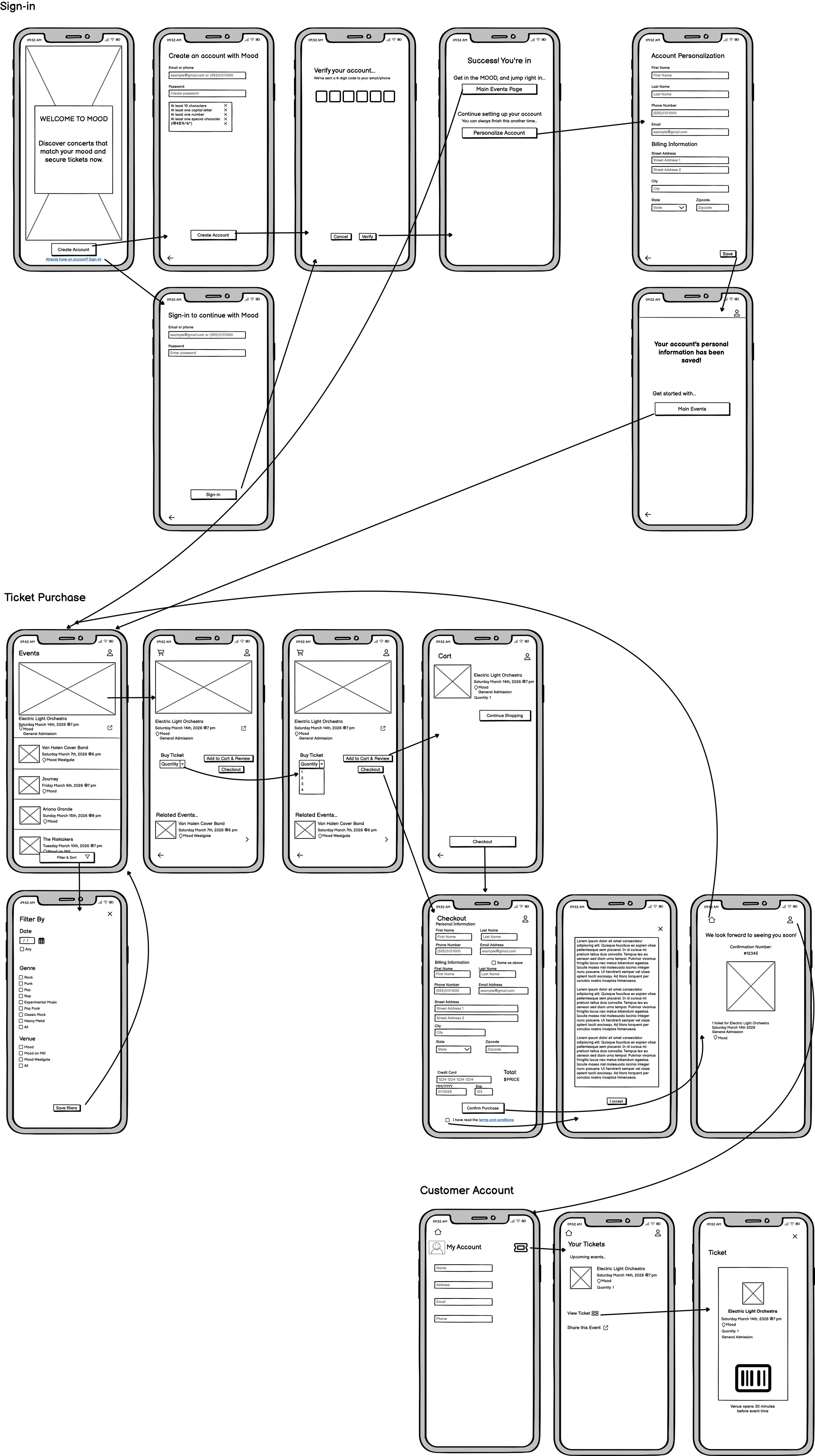
High-fidelity Wireframes
Product Constraints
All shows are general admission (no seat selection)
Users can purchase a maximum of ten tickets per event
Tickets must include a barcode compatible with the venue scanning system
Users must create an account before accessing events
Checkout requires specific billing and contact information
User Needs
Quickly see what events are happening
Filter shows by date, venue, or music genre
Purchase tickets before arriving at the venue
Store and access digital tickets easily
Find their ticket quickly when entering the venue
Share events and tickets with others
Business Goals
Increase advance ticket sales
Promote events across all three venues
Reduce door line congestion
Provide customers with digital tickets
Create a centralized platform for event discovery
Sponsor related events
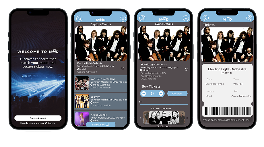
Prototypes
Users can filter through by date, genre, and venue to quickly find shows that match their interests.
Users are required to create an account and verify using their phone number or email before accessing the app.
Users can explore events on the main event page, which highlights a promoted event and takes them directly to checkout.
Reflection
Users can view their account and upcoming tickets to use their virtual ticket with a barcode to scan at the venue entrance
This project challenged me to design from scratch, focusing on the needs of the two provided personas. The thing I'm most proud of is how the product constraints shaped the design rather than limiting it. If I had more time, I would run usability testing on two specific moments: the account creation gate (does requiring an account before seeing any events create drop-off?) and the checkout flow (are the billing fields clear enough that users don't abandon mid-purchase?). I'd also explore whether a guest checkout option could serve casual users better without sacrificing the business's need for customer data.