
Bakery POS Tool
Creating an easy-to-use point-of-sale tool for a small business bakery.

Project Details:
Timeline: 4 weeks
Type: Academic Conceptual Project
Tools: Figma · User Journey Mapping · Persona Analysis
Role: UX Designer
Context: Internal point-of-sale tool designed for counter staff at Rose Family Bakery, a family-owned small business transitioning from social media orders to a physical storefront
How do you design a tool that reduces employee cognitive load and order errors while assisting the employee to feel conversational with the customer?
The Challenge
Rose Family Bakery recently made a big shift — from taking custom orders through social media DMs to operating a real storefront with real foot traffic. But their ordering process didn't make the transition with them. Employees were relying on memory to recall flavors, sizes, and customization options, writing orders by hand, and fielding questions from customers who weren't sure what they wanted. During busy hours, that pressure led to mistakes and slower service.
There was also a human challenge underneath the design challenge: the client wasn't fully convinced a POS system was worth the investment. The design had to work well enough to make the value obvious.
Approach
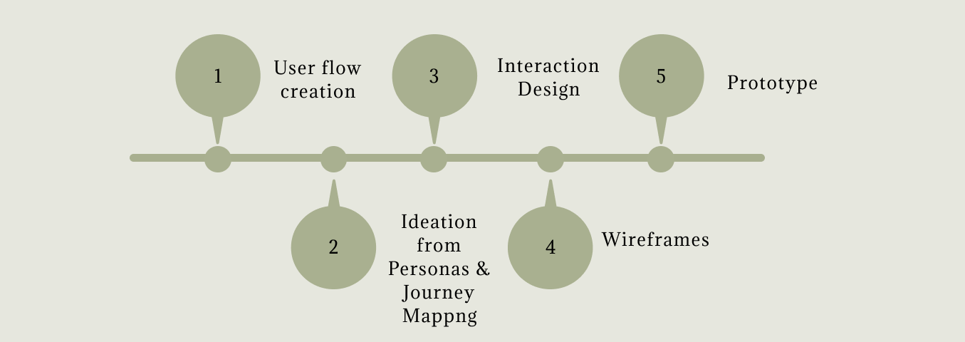
User Flow Creation & Ideation
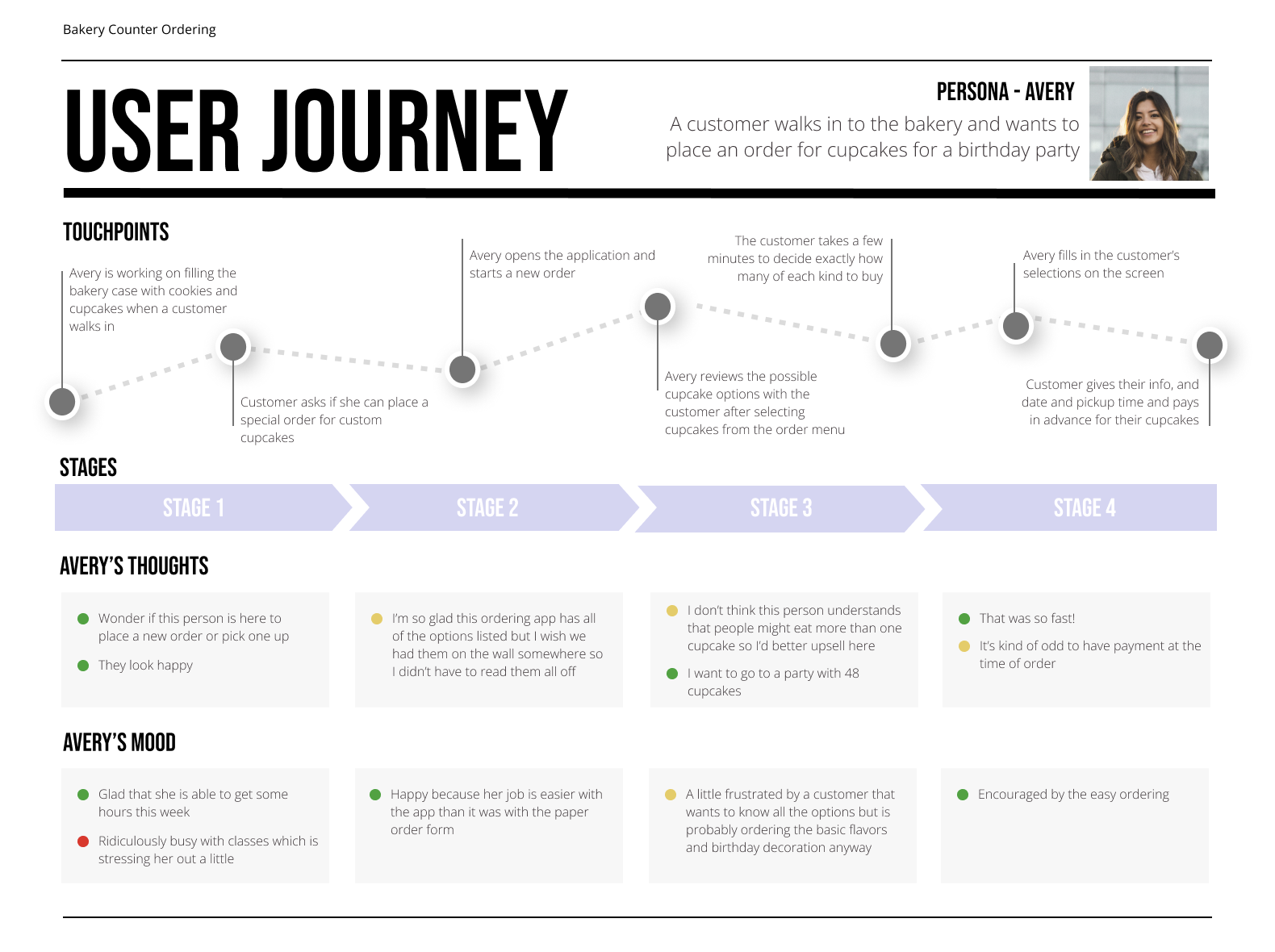
To understand the real shape of this problem, I worked from a provided persona: Avery, a bakery counter employee who knows the products well but constantly feels the pressure of customers who need guidance mid-order. Avery's journey map revealed something important — the most stressful moment in her workflow isn't taking payment, it's the unstructured middle section where a customer is still deciding. That became the anchor for every design decision: the tool needed to support exploration, not just capture a completed order.
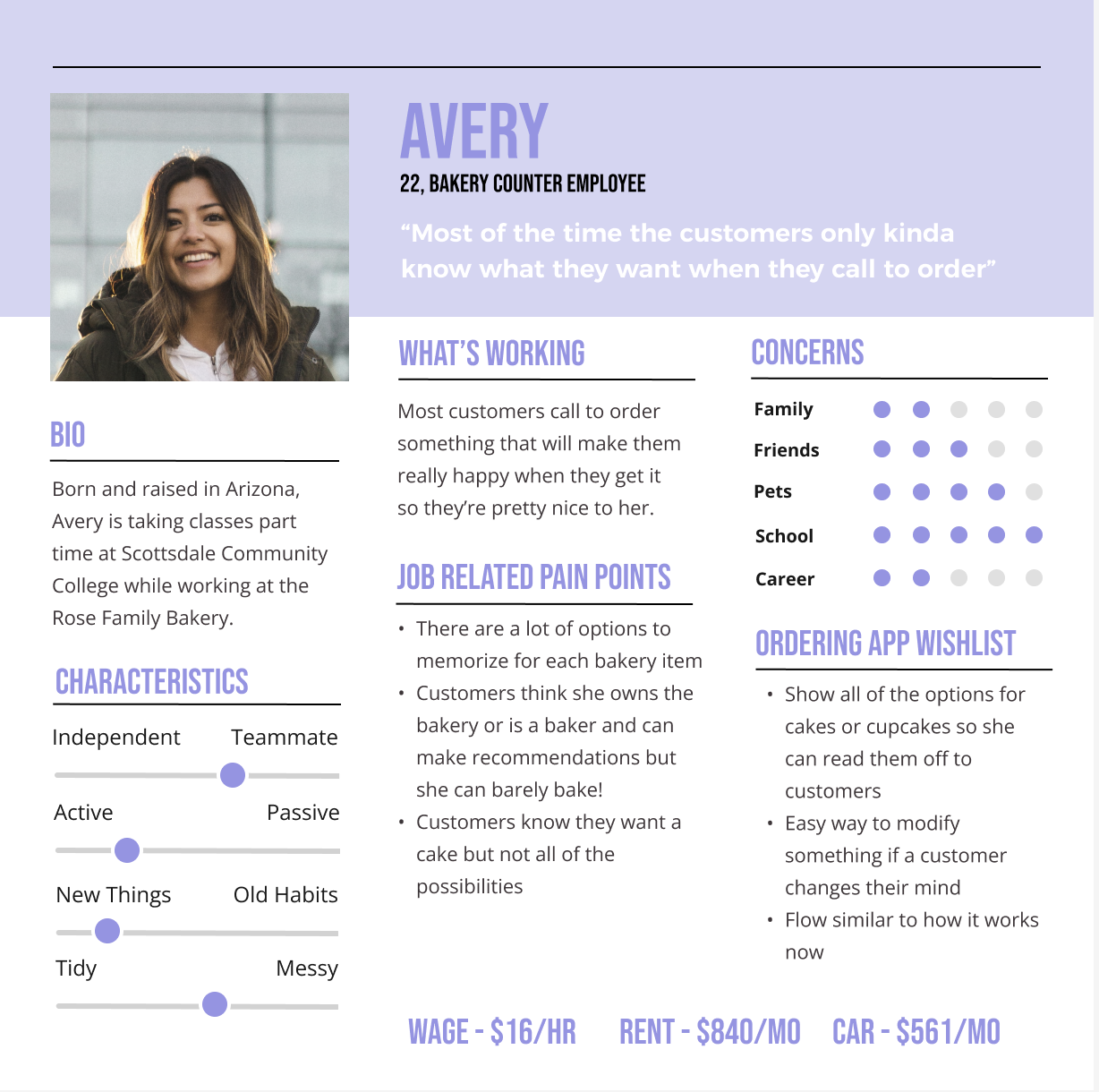
Avery's pain points translated directly into three design principles I used to guide the wireframes. First, visibility over recall — the system needed to surface every option clearly so Avery never has to say "I think we have that, let me check." Second, flexibility and speed — customers change their minds, and the tool had to make editing as easy as adding. Third, match the real-world workflow — counter ordering is a conversation, not a form. The low-fidelity wireframes were built entirely around those three principles.
Interaction Design & Wireframes
Low-Fidelity Wireframes
Aligning Design Approach Principles:
1. Visibility over recall
Show all relevant options clearly so employees don’t have to memorize anything.
2. Flexibility and speed
Allow quick edits without restarting the order.
3. Match real-world workflow
Design around how conversations actually happen at the counter.
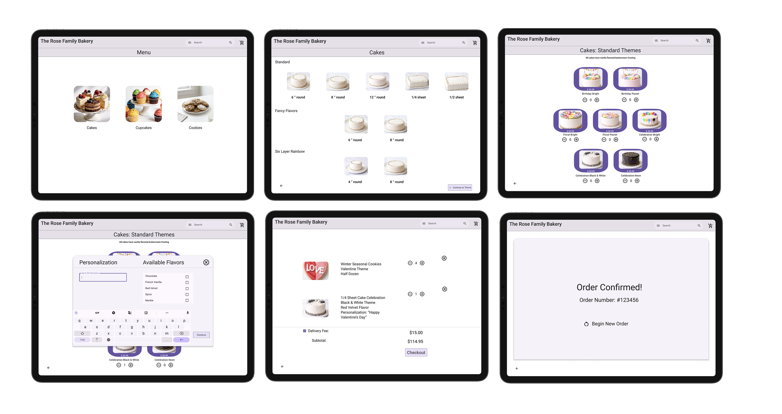
High-fidelity Wireframes
Prototype
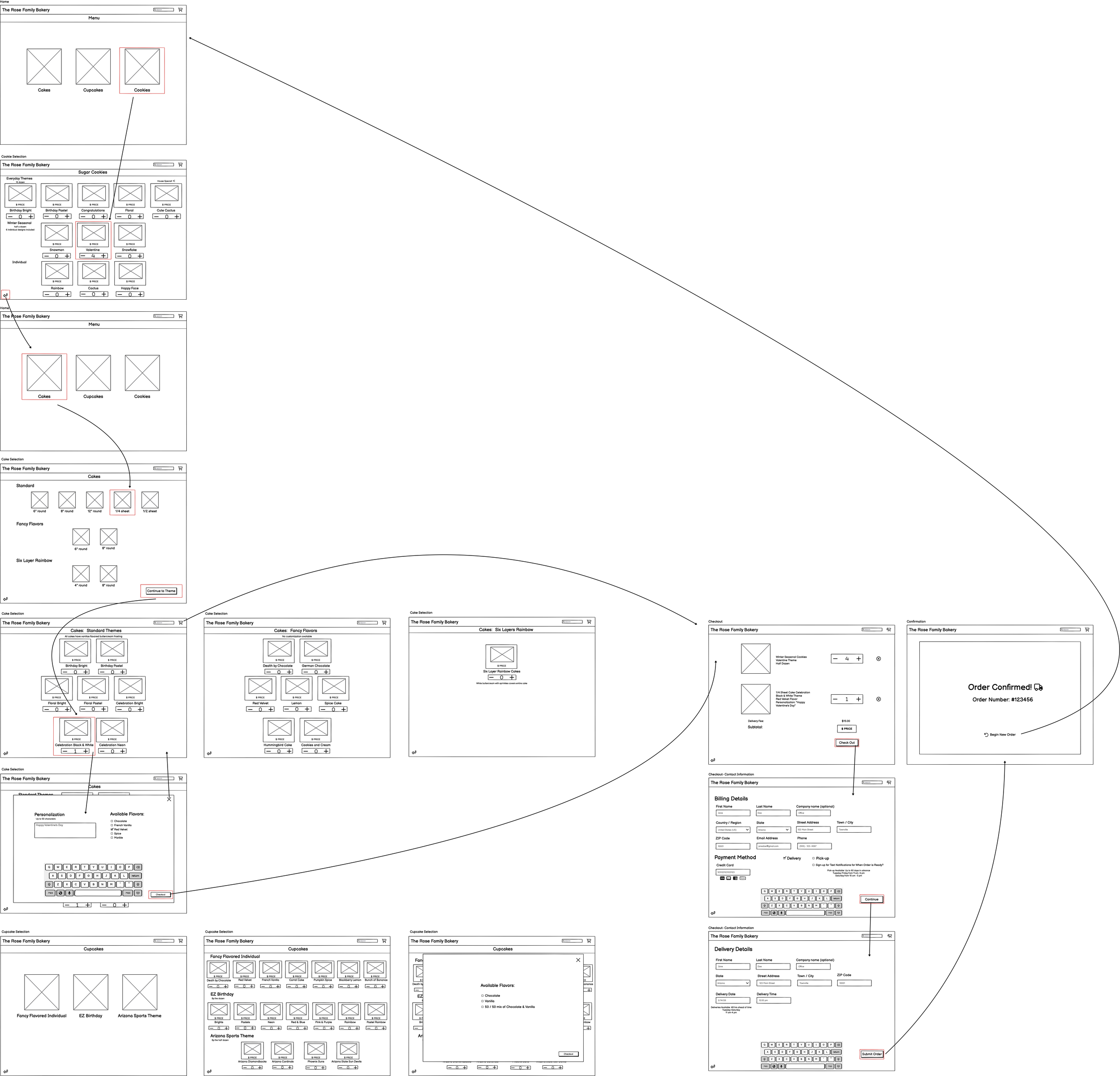
The low-fidelity wireframes confirmed the overall structure: a category-first menu, a customization layer, a live order summary panel, and a streamlined checkout. Moving into high fidelity, I focused on making the visual hierarchy work for a busy environment, including large tap targets, clear category labels, and an order summary that's always visible so nothing gets missed before the customer pays.
Even simple tools can transform operations. By focusing on usability and real workflows, this POS system turns a stressful process into a smooth, efficient experience—for both employees and customers.
The prototype simulates how a bakery employee would start a new order, navigate menu categories and options, add and edit items, and complete checkout.
Reflection
Designing an internal tool taught me something that consumer-facing work doesn't always surface: the user and the customer are two different people with two different sets of needs. Avery is not just taking an order; she's managing a conversation while a line forms behind the customer. Confusion in the UI is a pressure on the employee. That reframing made me much more intentional about reducing cognitive load and keeping the interface out of her way.
Moving from verbal and paper-based ordering to a structured digital flow isn't just a design improvement but rather a change in how the business operates. If I had more time, I would observe Avery — or workers similar to her using the POS tool before finalizing the design. I'd also want to test whether the step-by-step order flow feels natural at counter speed, or whether experienced employees would prefer a faster, more flexible input method once they're comfortable with the system.